When Metorik began years ago, the first section built was the dashboard - a central place to monitor the health of your store and make decisions.
Since then, it's been drastically imported, with an improved design, additional reports, real-time updates, and more recently - multiple layouts with the ability to customise them.
But it had been missing one key feature: Best sellers. Of course, this data has always been available on the products page or variations page, but it was missing on the dashboard.
So I got to adding it, but in the process, ran into issues...
What if stores only wanted to show products from a certain category?
What if a store wanted to show worse sellers?
How about showing best categories?
And then it hit me: Rather than try to add a 'products list' card to the dashboard, I'll just add an 'anything list' card.
You can already choose any 'resource' (eg. orders, products) and show the totals for it on the dashboard:

So I just took a similar approach, but instead of showing 'totals', it shows the actual data, like so:
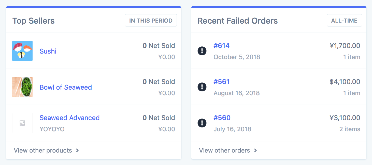
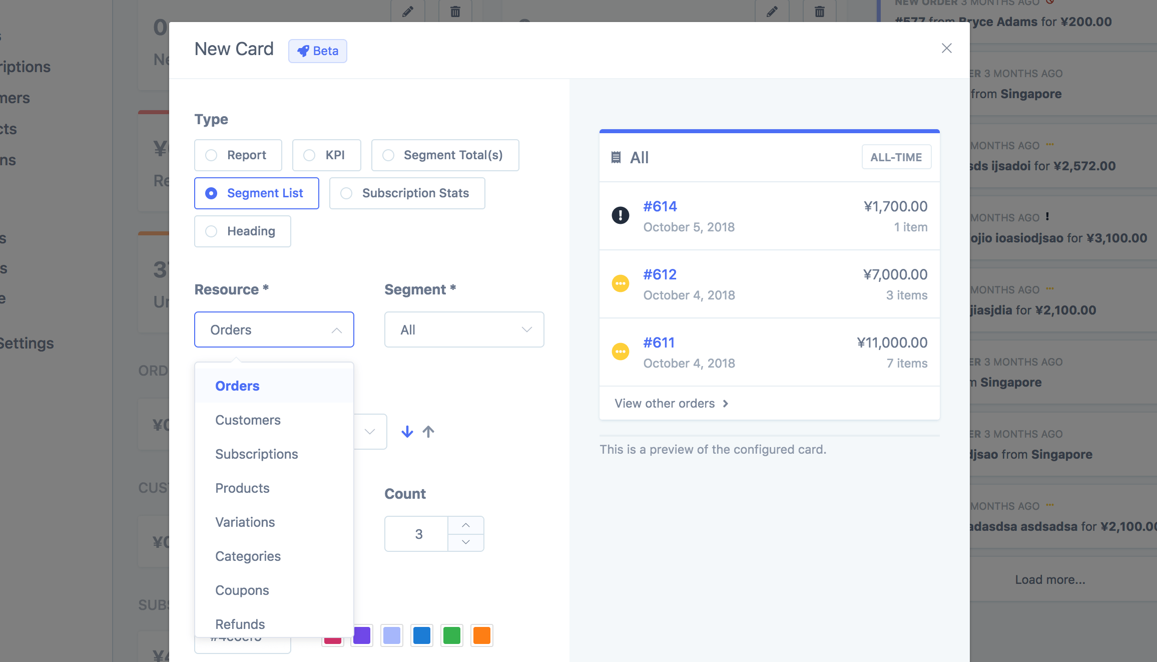
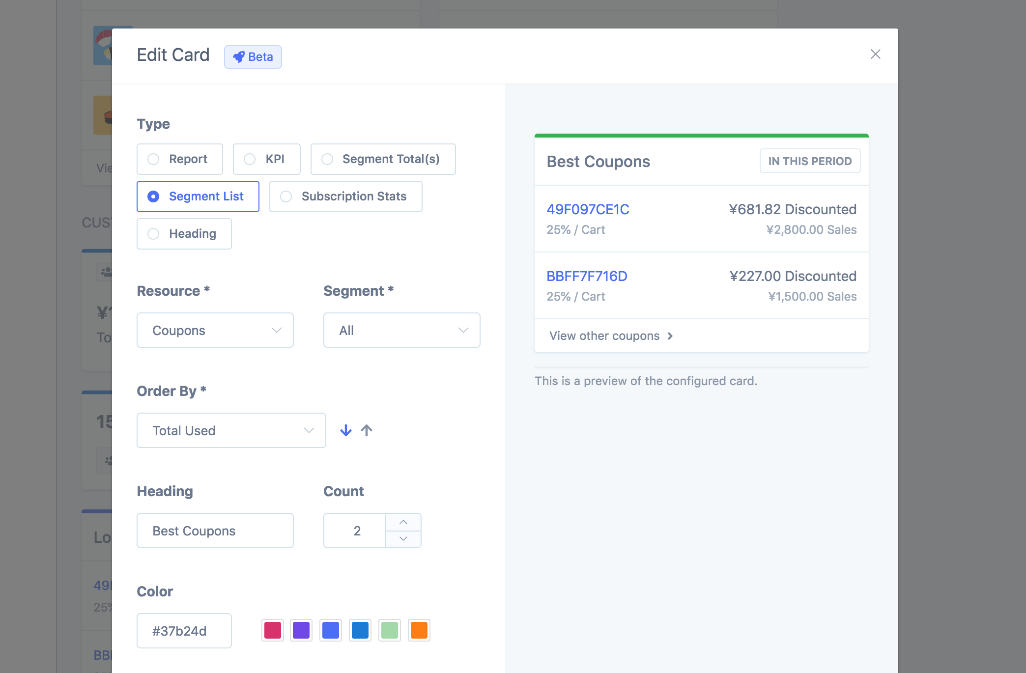
But it doesn't just show products and orders. When adding or editing a card, and using the segment list card type, you can choose from any of your store's 'resources'.
You can then optionally choose a segment to limit the results to, and what order the results should be shown in (eg. order products by most sold or customers by their last order date). You can even give the card a custom heading or change the number of results shown in the list.
Getting excited but need some card ideas? Here are a few off the top of my head...
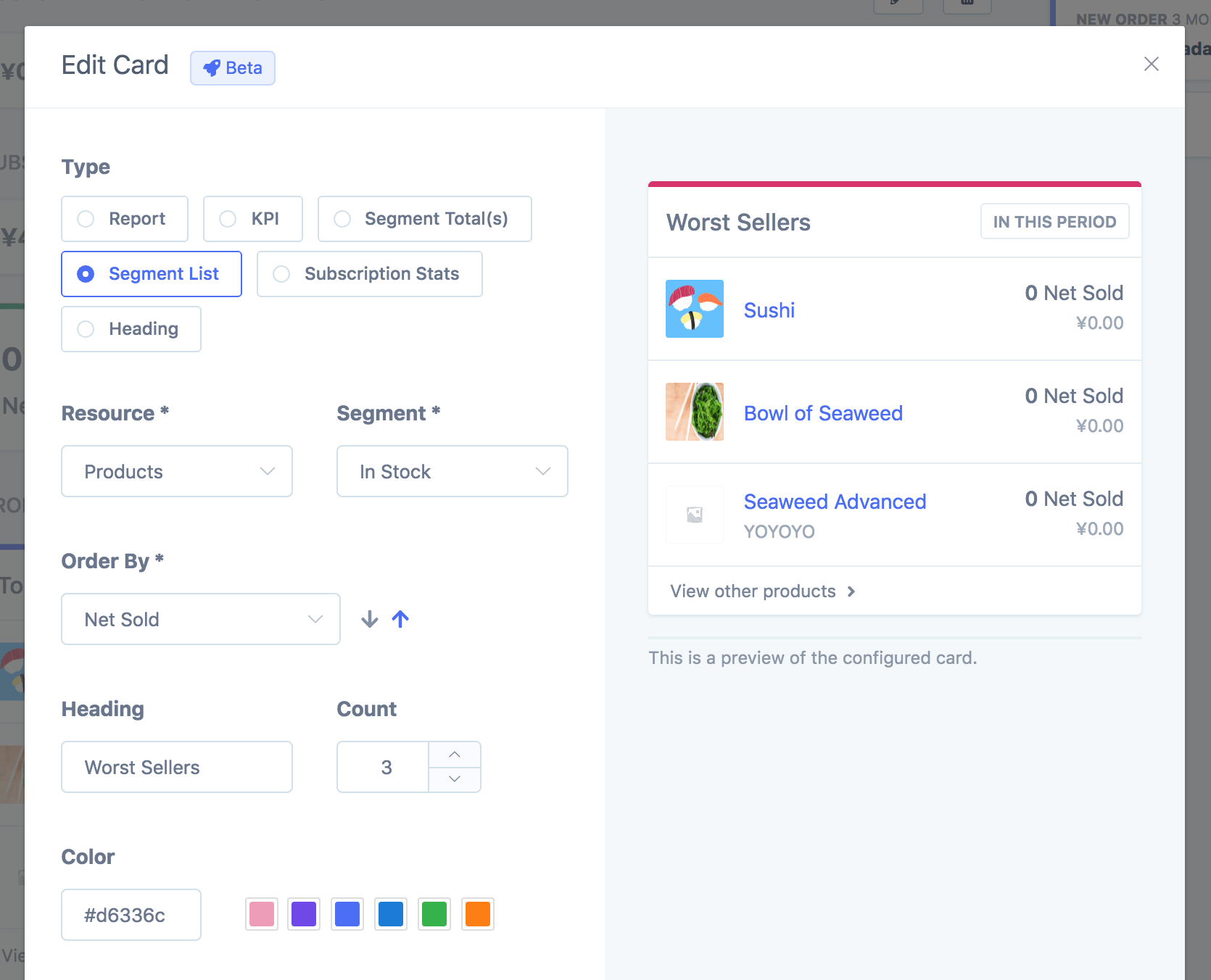
Worst Sellers
Here we're getting products that are in the 'in stock' segment, ordering by the net sold amount, and ordering in ascending order (least to most), to show us our worst sellers:
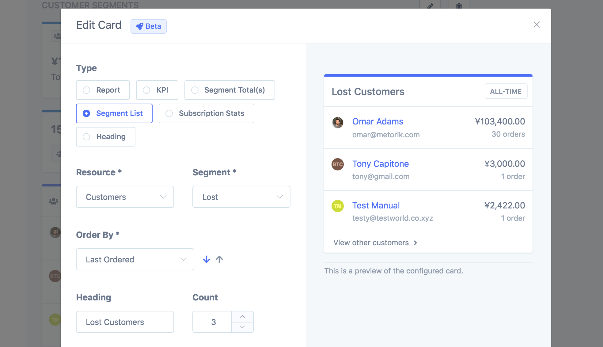
Lost Customers
In this card, we're getting customers from the 'lost' segment, ordered by the last order date. This allows us to easily see customers that have been lost recently so we can contact them (or better yet, just send them an email automatically with Engage):
Best Coupons
This card shows our top 2 coupons, ordered by the number of times they've been used:
I'd love to hear how you use it, so please send over any combinations you come up with that you think others may benefit from.
One more thing...
Oh yes, I forgot to mention the other improvement I made!
While adding this feature, I kept finding that I was running out of space for all the cards I wanted to add. And then I thought: Maybe some Metorik users don't want to show recent events on the right of the dashboard? Especially those of you who have the Metorik dashboard up on a TV in your office.
So I added a new layout setting called Full Page:
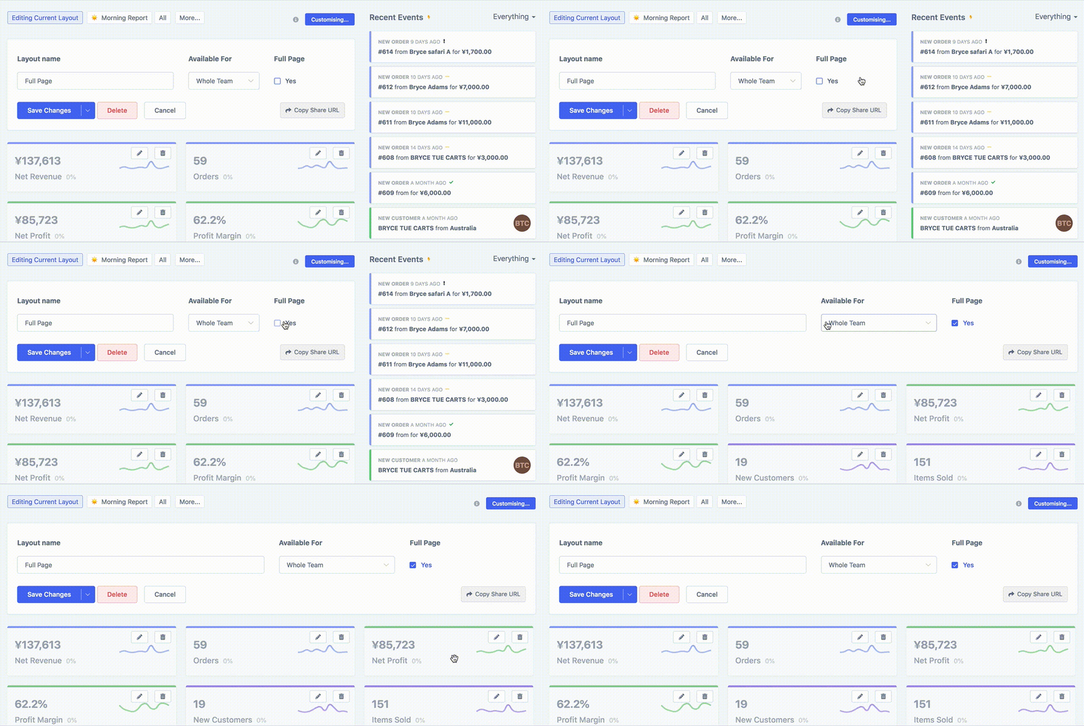
As you can see, by enabling the full page setting, the dashboard stretches across the full page, giving you 3 columns to work with instead of the regular 2 columns (later I'll be making it 4 columns on larger screens!).
I hope you enjoy these new improvements to the Metorik dashboard and can't wait to add more very soon.
