A couple weeks ago, I found myself awake much earlier than usual. It was 4.30am and going back to sleep didn't seem like an option.
I grabbed a drink, sat down, and opened my laptop. I went to open up the Metorik dashboard and was hit by the bright, white light coming out of the screen.
"I should have probably built dark mode by now", I mumbled to myself.

As I was about to add it to a todo list, the behind the scenes post I'd written just a few days earlier came to mind. It was about our desire to do some harder things over the next year, so what was I waiting for? I started playing around with different colors, and it felt like a possible, but difficult task.
But slowly, day by day we chipped away at it and ended up with a seamless transition between light and dark mode throughout the entire app.
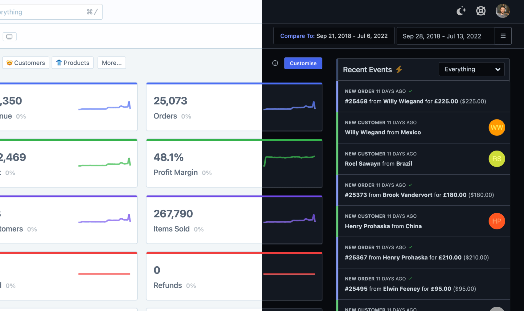
By default, we'll check the color mode set on your computer or phone (even if it's set automatically), and use that. So if your computer is in dark mode at night, Metorik will automatically switch to dark mode.
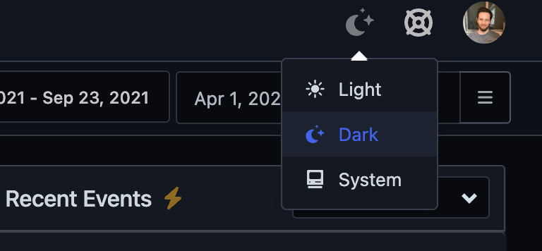
You can also manually switch to either light or dark mode, using the dropdown at the top right of the app. Metorik will then remember this in your user settings and apply it regardless of your system color mode.
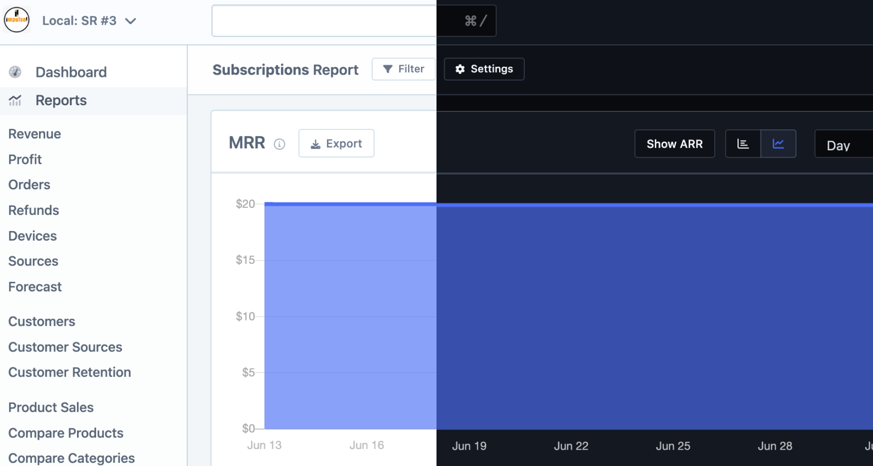
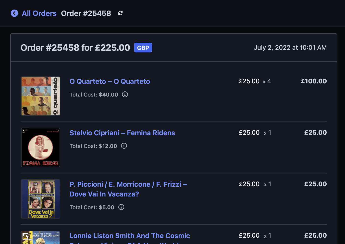
Here are some other parts of the app in dark mode now:
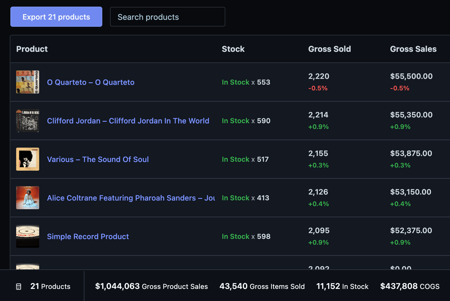
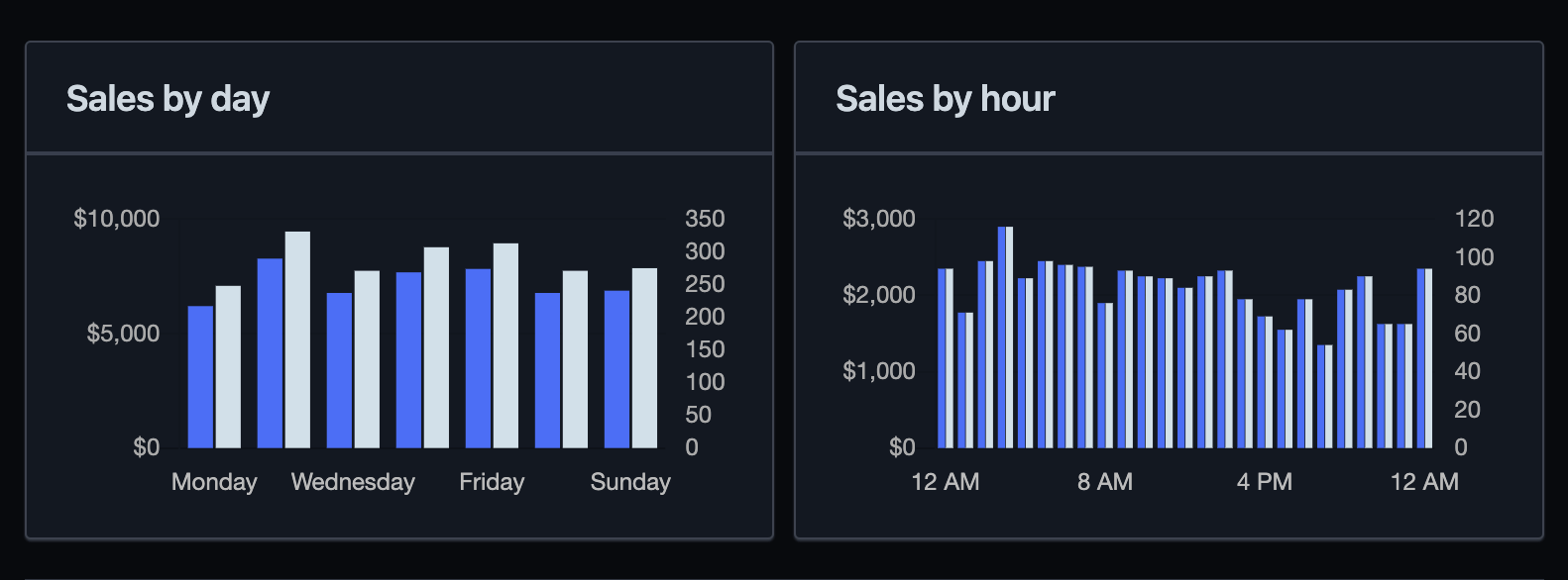
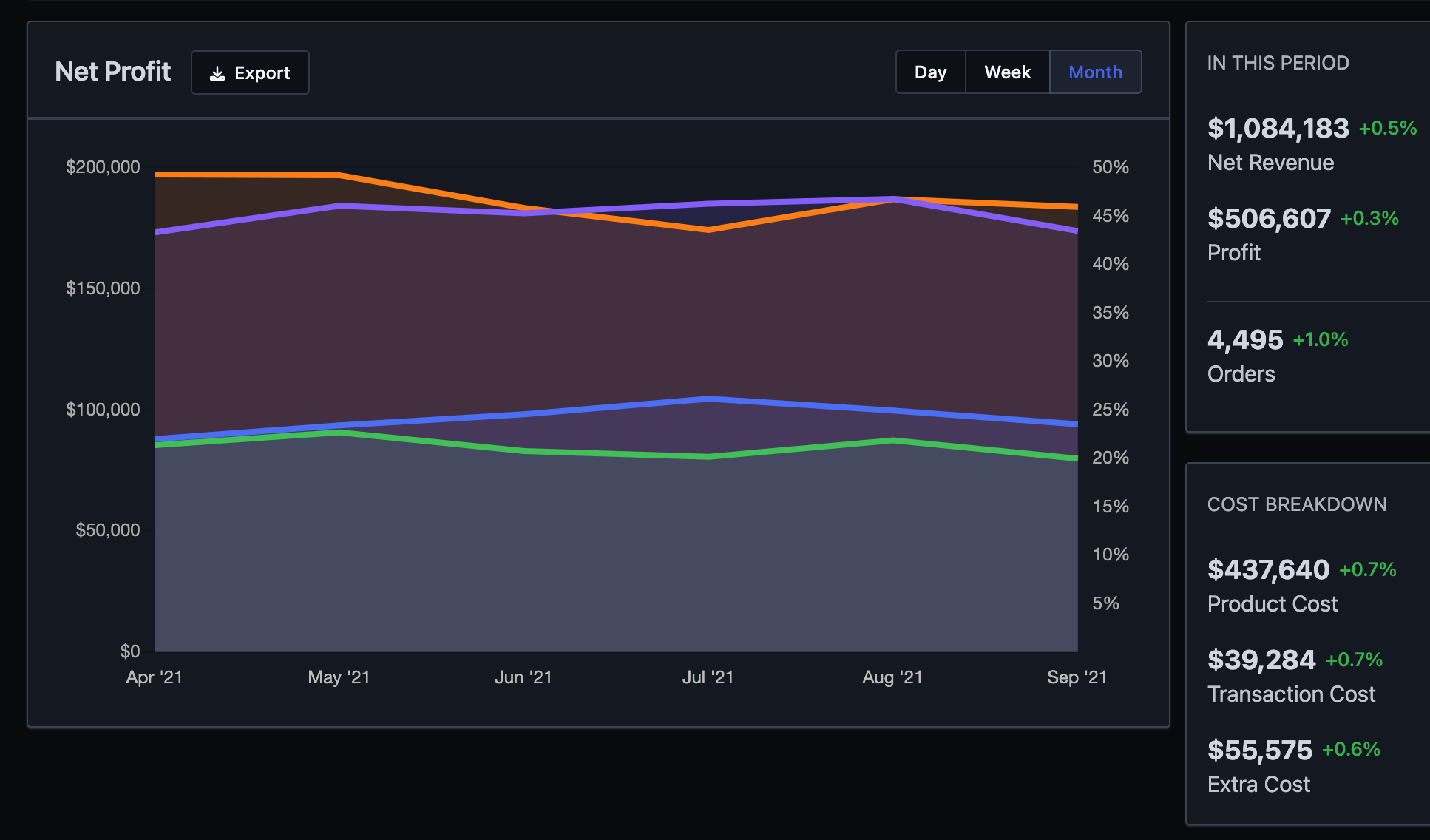
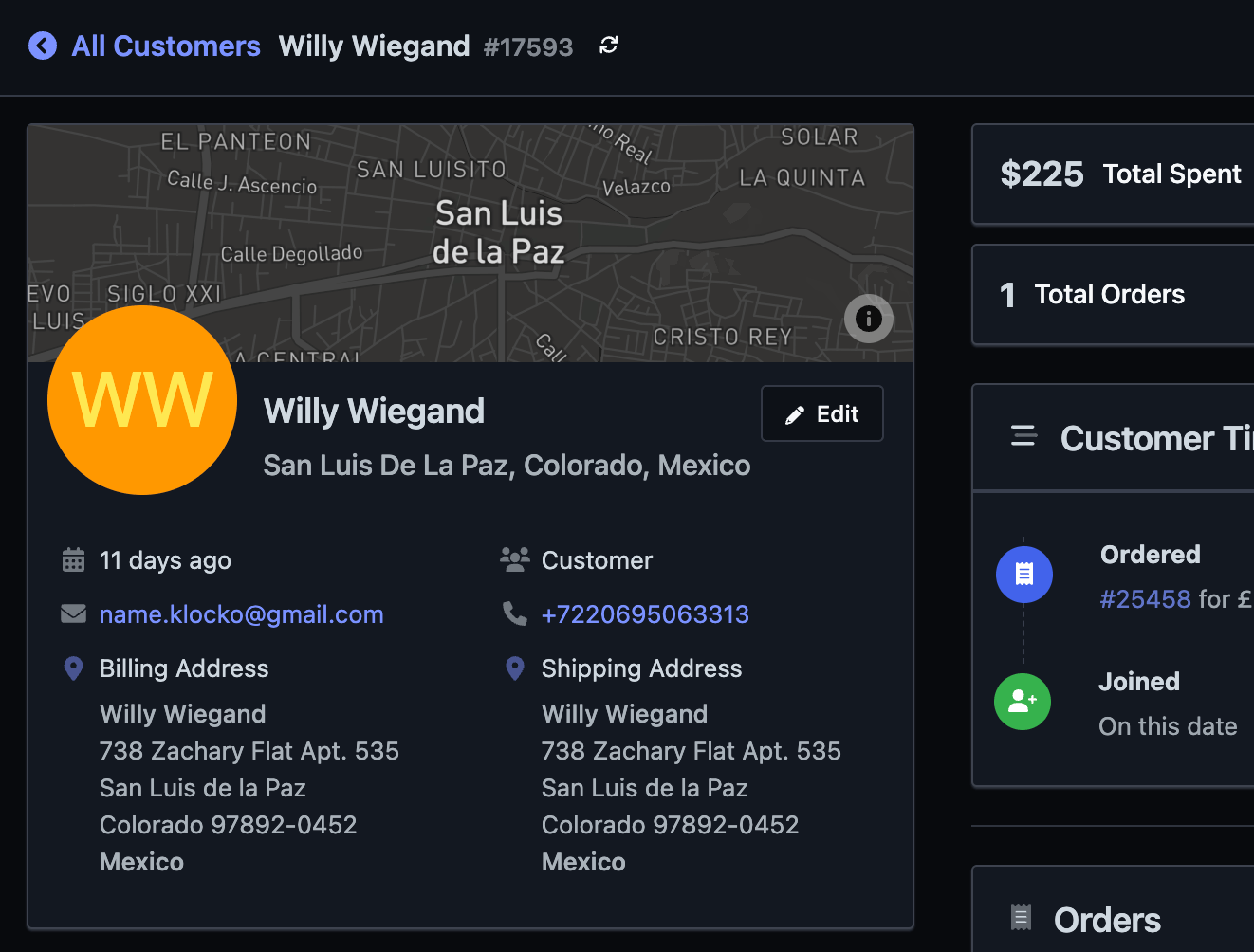
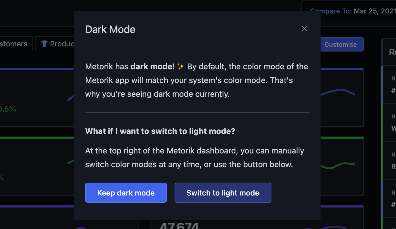
Since it's a big change, I decided to show a small popup one time to those who have system dark mode on, explaining why Metorik is now in dark mode and how they can go back to light mode if they'd prefer.
It's a simple addition, but one I'm proud of and personally excited to use more whenever I'm in the app. I hope you find it useful too.
I've also written a bit about building this feature behind the scenes, with some notes on how we went about implementing it, and some example CSS/JS - read Adding dark mode to a large SaaS app.
