Overview
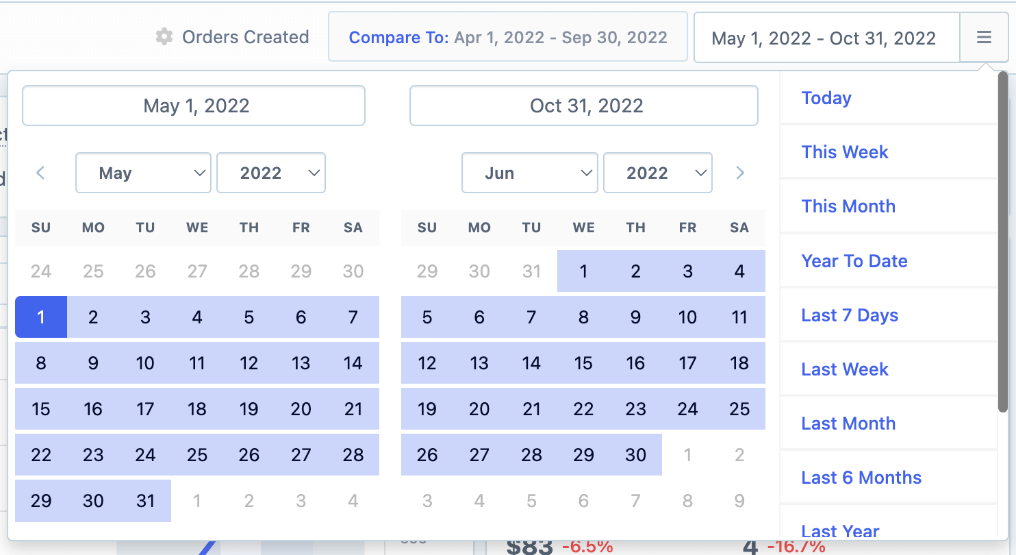
The first step is to specify the desired date range for evaluation, whether it is the current year or a specific timeframe.
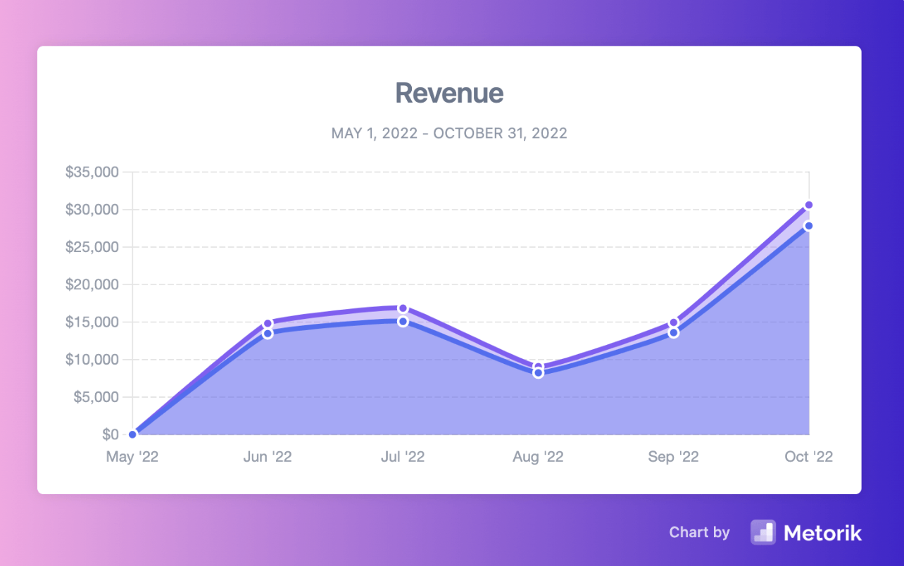
You will then see the graph showing the number of orders within the specified date range.
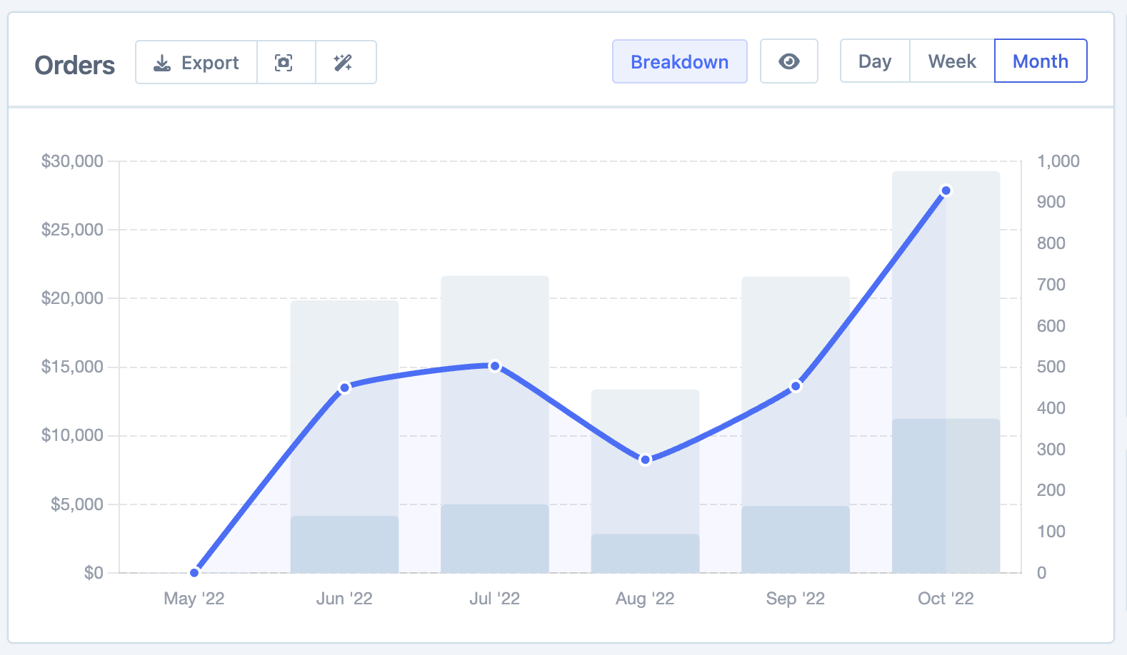
You have the option to select the display by day, week, or month intervals.
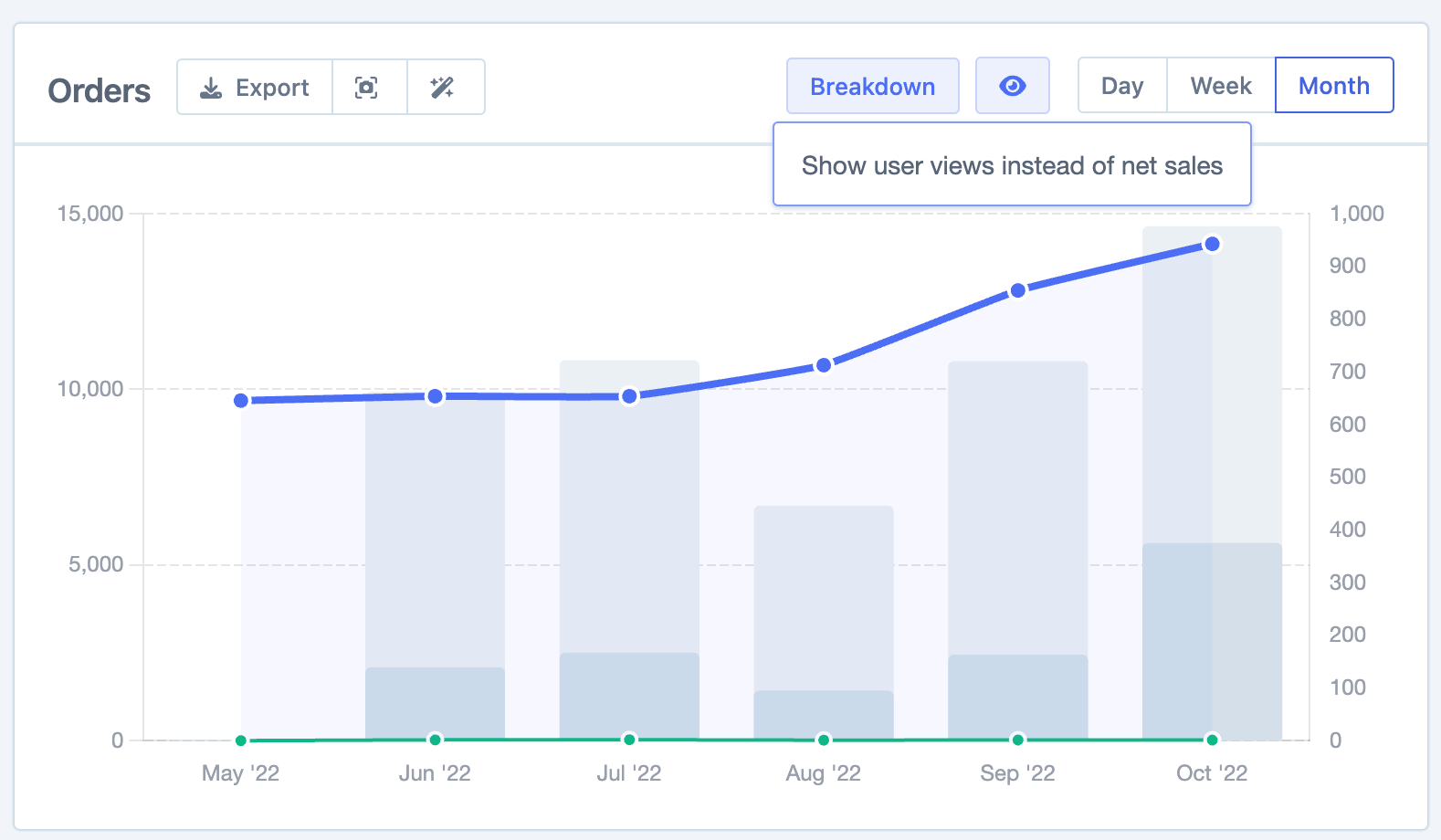
Additionally, if you have the Google Analytics integration set up you can switch the graph to show the number of user views instead of net sales.
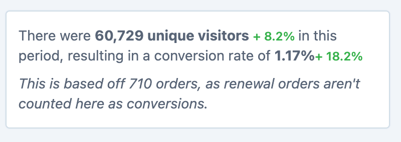
There is also a section for looking at unique viewers and conversion rates.
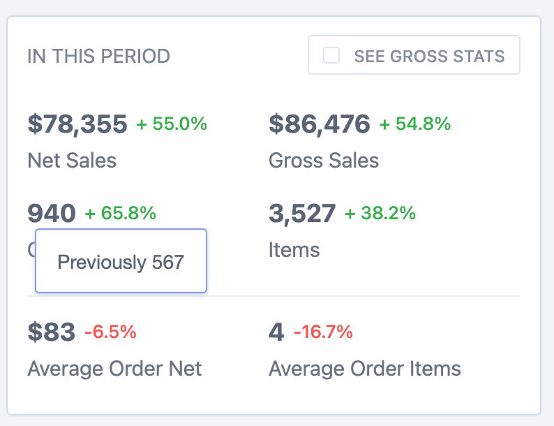
Further down there is a breakdown of overall stats, which can be toggled to show either Net or Gross sales.
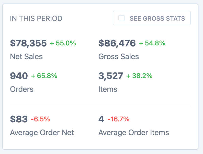
If you check the checkbox next to each statistic, it will be included in the graph along with the respective % value. Additionally, hovering over the % value will display a "Previously" value for comparison.
This corresponds to the "Compare period" functionality, which enables you to compare data with other time periods. This aids in identifying metric growth, and you can find detailed information about this functionality in the full report here: Comparing Periods in Metorik.
Breakdown
The next section has a breakdown of all the different values that make up the orders such as Shipping, Taxes etc plus some Order averages such as Item and Order values.
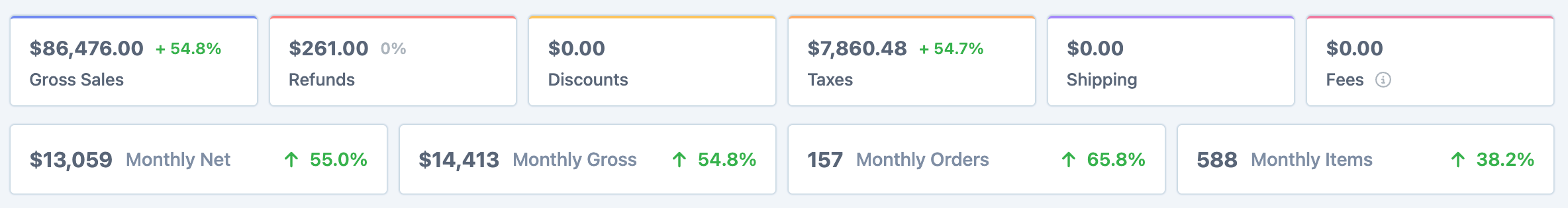
Refunds
The refunds value that is shown is for the refunds made for orders placed in this period, this is slightly different from how the Revenue Report in Metorik functions. A full explanation with examples can be found in this help doc: Net Revenue and the Orders Report.
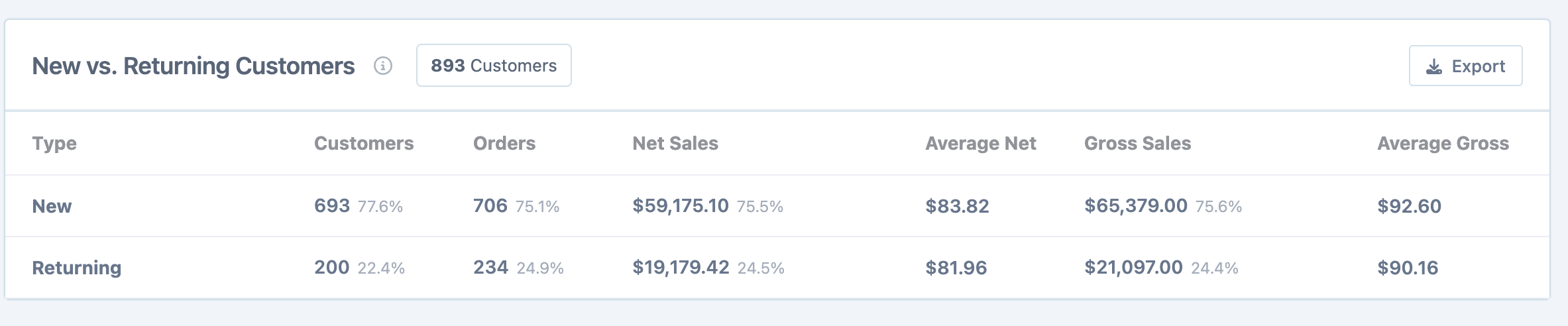
Group by new and returning customers
Metorik has several different ways of looking at this depending on your parameters that define what a New/Returning customer is. We have a full guide on this here that runs through the different options and what the Orders report conditions are for determining each type - New and returning customers.
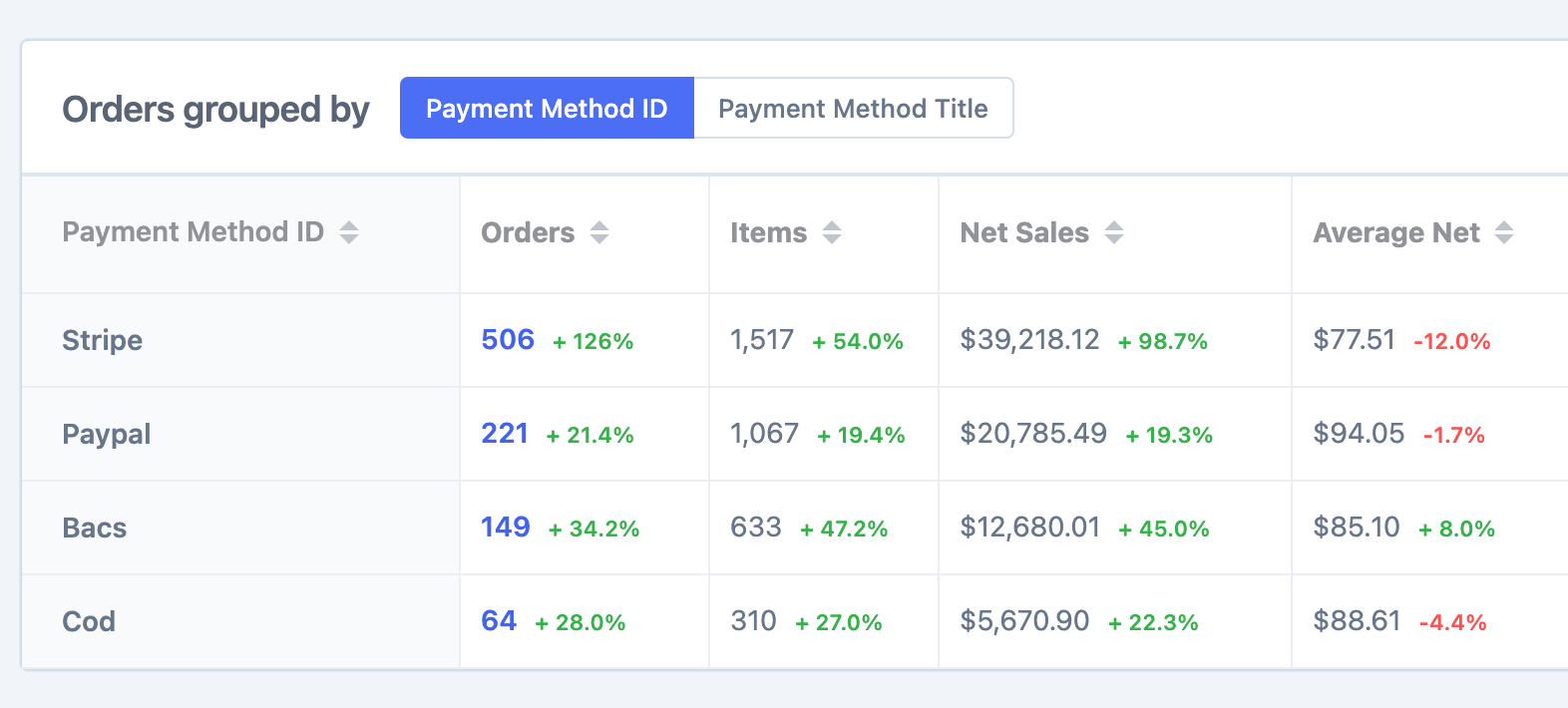
Grouped by
There are multiple sections here to view the order data grouped by different things such as Payment method, Order status, Shipping method, Currency and several others.
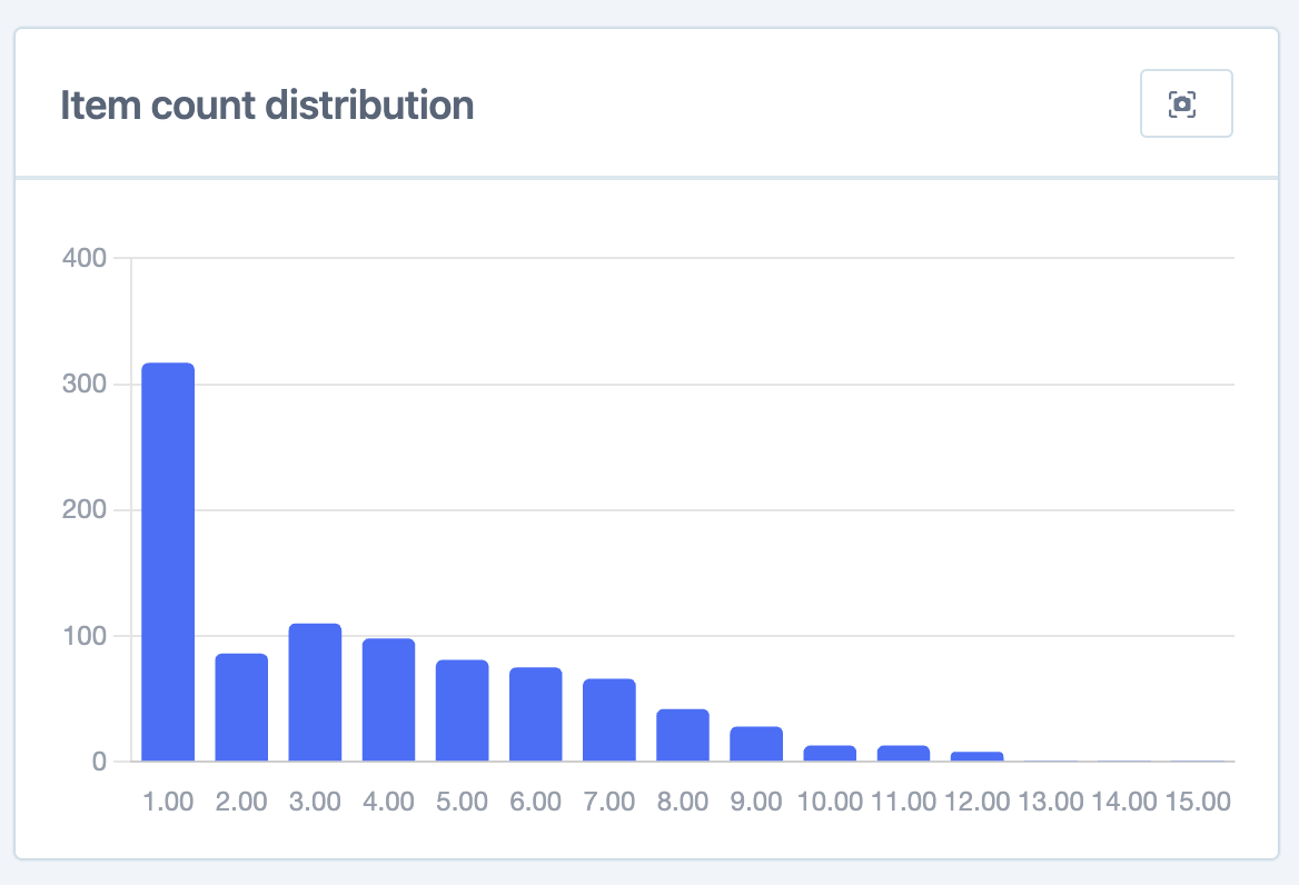
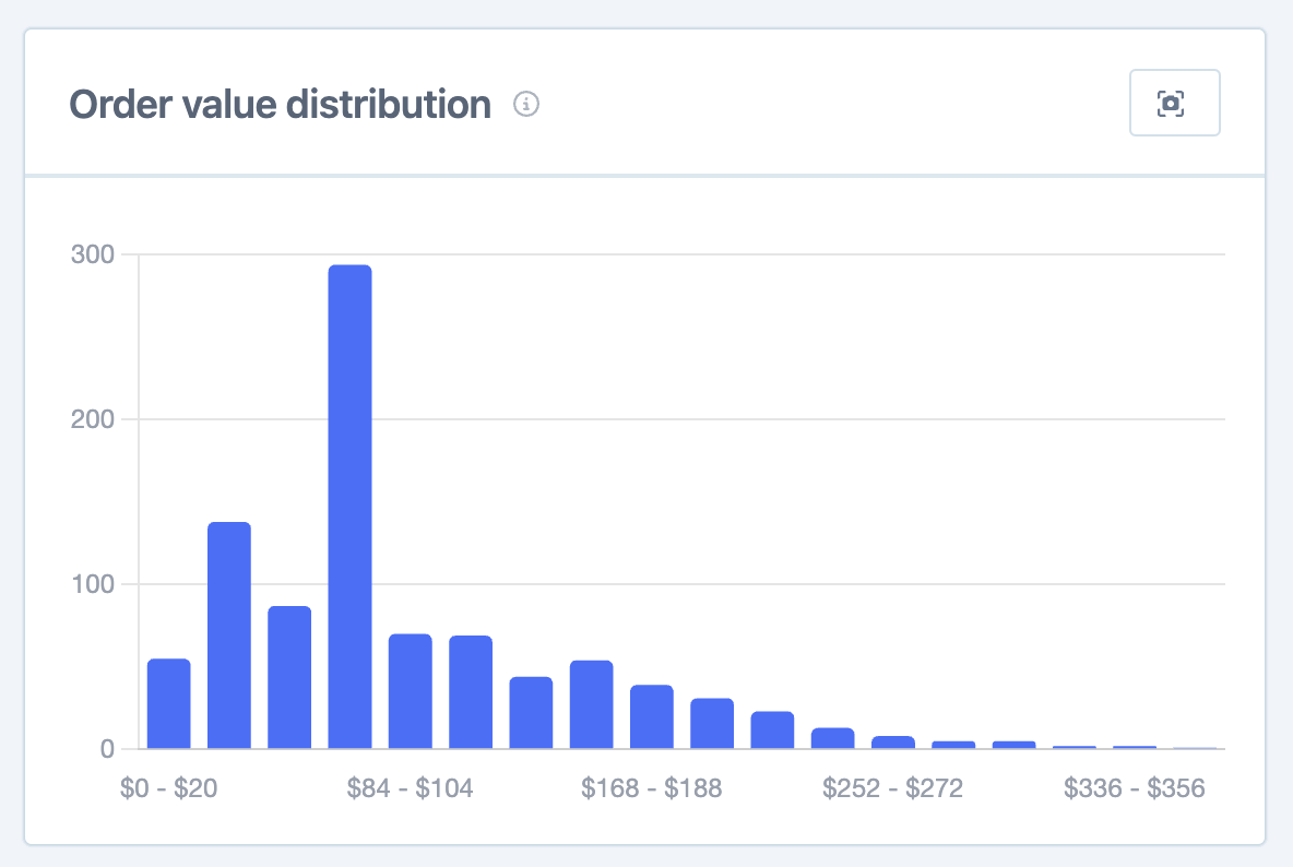
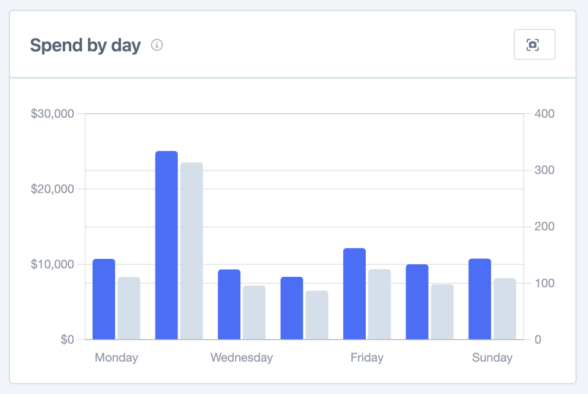
Additional graphs
The last section is a selection of graphs with each one representing a different way to view the order data.
Item count distribution.
Order value distribution.
Spend by day (and hour).
Exporting
Within each section of the report, you will find an export button available. By choosing this option, you can download a CSV file encompassing all the data related to that specific section. This data can then be utilized for external analysis purposes.
Additionally, within the graph area, there is a download button that enables you to save the chart as an image.
For more detailed information on this functionality, please refer to our article: Download custom chart images in a couple clicks.
Segmenting
You can choose one or multiple filters from hundreds of different filters so that you can customize the data within the report to match your precise specifications. We have an article called Segment reports by 100s of different filters that explains how you are able to segment the reports using the Segmenting Tool.
